
Sunday Rep 001: Try this AI visuals tool!
Paste text and let AI build you the right visuals, instantly.

Hey, y’all --
We’re going to the AI gym! It’s time for our first Sunday Rep: turn text you already wrote into a diagram in just a few minutes.
Every week, I’ll share a tool or method that you should try.
Something important to note: don’t overdo it. It’s more important that you try a Sunday Rep, even if your temptation is to make a big project out of it or wait for the perfect moment. This era of AI is moving too fast, so it’s more important to use the tool or method, learn about what's possible & what’s changing, and move forward!
I try every tool I see for at least one “turn” -- but, 99% of them? I never return again! That’s okay. Embrace the drive-by try.
(btw, I’ll almost never have any financial relationship w/ the companies in question -- they’re just great demonstrations of what’s new -- I’ll let you know if there’s ever a mixing of interests.)
Okay, all of that in mind --
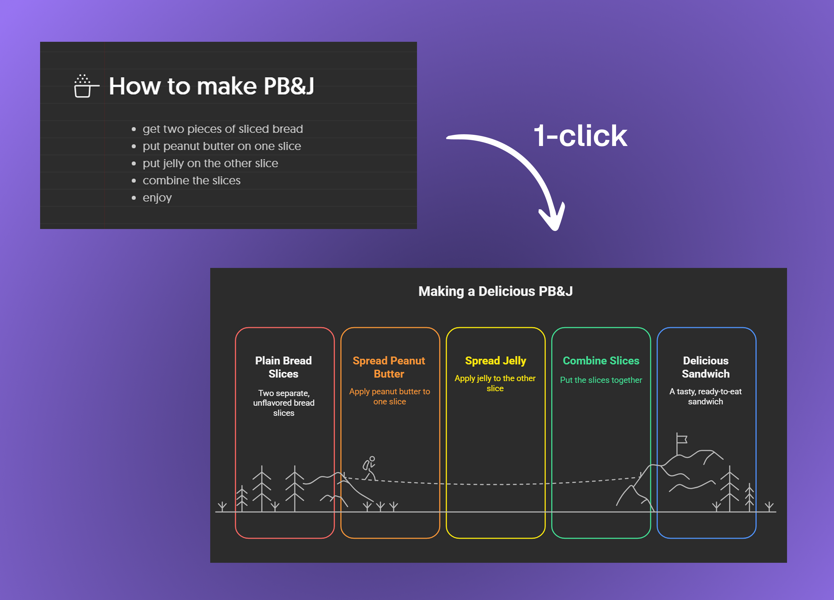
Sunday Rep 001: try out Napkin AI (free tier will be enough). Napkin lets you quickly turn text into visuals -- whether that be a diagram, a chart, or a funnel.
Why is this one to try:
Tools like Napkin are what I call “structured output tools.” They sit between raw LLMs (like those we use inside ChatGPT, Claude, etc.) and a ‘design suite.’ They take things like text and map them into pre-built visual ‘grammar’ to make high quality results that are consistent and editable.
Tools like ChatGPT and Claude aren’t always great at producing visuals and infographics. That’s because they can’t really “see” their output as they make it, so you’ll usually get something rough and unusable.
Napkin, and others like it, surround an AI model with context and ‘tools’ to use a pre-baked and pre-built ‘application' -- this is their main innovation.
So, it’s trained to go… “okay, the user gave me bullets that belong in a flow… Napkin built a ‘flow’ module I can use… I see there are 5 types of pre-built flows… based on the info from the user, this particular flowchart is best.”
And then it calls on Napkin’s API -- for those of you who aren’t technical, think of this like a ‘pipe’ to Napkin’s core functionality -- to actually produce the visual. It’s basically going, “Napkin, put down a funnel please, make it this size, and put this information in section 1, this in section 2, etc.”
And since Napkin pre-built all of the visual ‘containers,’ they’re just asking the AI to help figure out which container is best for the use case, and the order and layout of that content.
So, here’s what to try:
Head into Napkin with meeting notes, some data, or some made up workflow.
Paste it into Napkin → select your relevant text → press the ‘Generate Visual’ button that’ll show up next to it. Scroll through the recommended options!
Try editing the labels, using different visualizations, exporting, etc.
Another tool in this vein: Gamma, which does it for slide decks. The decks are ugly, but they (or someone else) will figure that out eventually.
Pro-tip: these tools will often offer to generate the text content of the slides or graphics for you, too. Don’t!
First, you’re probably still better off writing all of your content with AI as a collaborator, rather than letting AI write anything for you (I’ll talk more about this in coming weeks).
Second, they’re often using far weaker, dumber models than what you get in ChatGPT, Claude, or Gemini. So, write on your own first (in collaboration with your favorite AI as a brainstorm partner and editor), and then bring it to a “AI tools for structured output” tool. :)
OK, that’s all for now!
Off to fight with fascist venture capitalists on Twitter. Wish me luck.
Balding by the minute,
Sherveen
Thanks for sharing these tools - I'm going to give them a try.